Vernicia
Typeface design
Project initiated during TypeParis 2019.
View the project on TypeParis website.
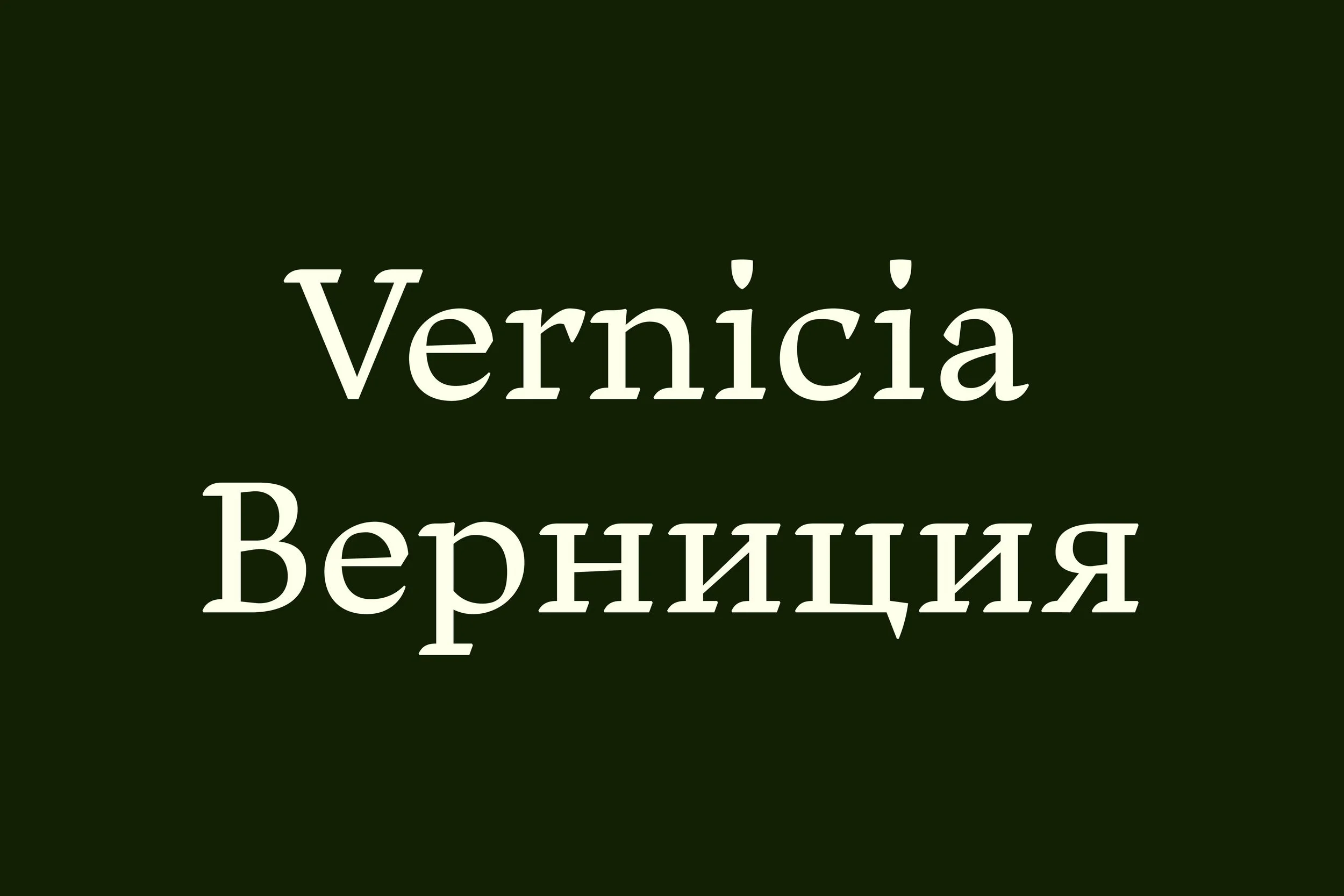


Vernicia is a serif typeface family exploring a natural fusion between Latin and Chinese calligraphy. The typeface is intended for literature and books, especially those translated from the Chinese language, to infuse the text with a more organic and calligraphic texture, as well as a sense of Chinese origin. The typeface family currently consists of Roman and Italic, each available in three weights.
The design of the typeface started with Latin humanistic calligraphy with broad nib pens, and as the calligraphy was being transformed into type, the Latin letterforms were gradually shaped by my own background in Chinese calligraphy. Characteristics from Latin and Chinese calligraphy were then studied and compared, and a series of iterations and adjustments were made in order to determine the right balance between Latin and Chinese, without pushing it too far or turning it into something clichéd. The italics were designed with Ludovico degli Arrighi’s calligraphy work in mind, which introduces a more angular and condensed texture, in order to contrast with the wide letterforms of the main style.
The name of the typeface comes from the Latin name of tung-oil tree, vernicia fordii, which is a species native to southern China, and is traditionally used to make Chinese calligraphy ink.
The typeface was initiated during the TypeParis19 course. Special thanks to the teaching team at TypeParis19: Jean François Porchez, Mathieu Réguer, Marc Rouault, Xavier Dupré, Julie Soudanne, & Gina Serret.
← Back