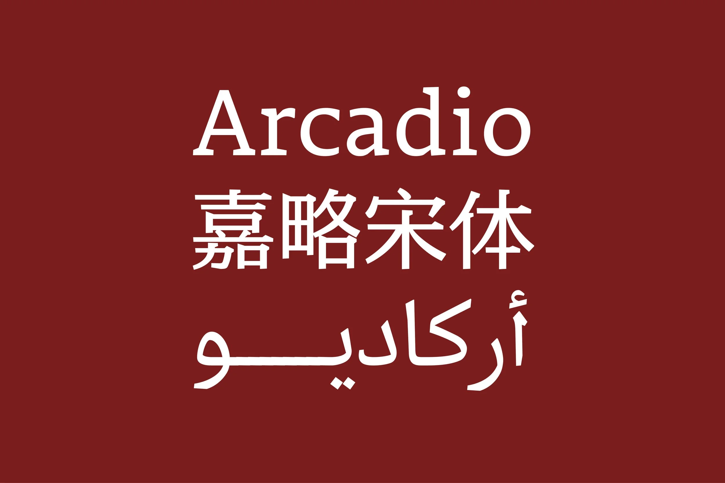


Arcadio is a variable multi-script typeface family, covering Latin, Chinese, and Arabic, designed for digital dictionaries and other complex linguistic contexts. The design space includes a weight and a contrast variable axis, providing a wide range of styles for establishing typographical hierarchy and expressing a variety of design voices. The design aims to strike a balance between the humanist and the geometric, while having optimized performance for digital media. All of the letters and characters have multiplexed width between their weight and contrast variations, making it particularly suitable for web and interaction design.
Each script of the Arcadio family draws from different sources, while following a unifying design philosophy to make sure they work together harmoniously. The Latin is developed from the humanist Slab Serif model with elements drawn from humanist Sans Serif; the Chinese is a hybrid between traditional Songti and humanist Heiti; and the Arabic is mainly based on the modern Naskh style, with some influences from Chinese Qu’ran manuscripts. For all the scripts, the strokes and structures show humanist influences and handwriting gestures, and interpreted in a geometric and abstract way, giving the typeface an overall rationalized appearance with a touch of warmth.
Many thanks to the teaching team at Ésad d’Amiens: Sébastien Morlighem, Patrick Doan, Hugues Gentile, Hélène Marian, Frederik Berlaen, Jean-Baptiste Levée; as well as to my classmates: Anagha Narayanan, Hirbod Lotfian, Lucas Voilquin, Victor Zumegen, Abhijit Menon, Đông Trúc, ibrahim Kaçtıoğlu Martin Brendecke
← Back