平仄 Ping Ze
Calligraphy, graphic design, book binding
MFA Graphic Design thesis project at Boston University, Boston, USA, 2018.

This project investigates the classical Chinese ci poetry, and explores how to translate abstract literary and phonological concepts into visual elements, in order to make them more accessible to the audience regardless of their knowledge of the Chinese language.
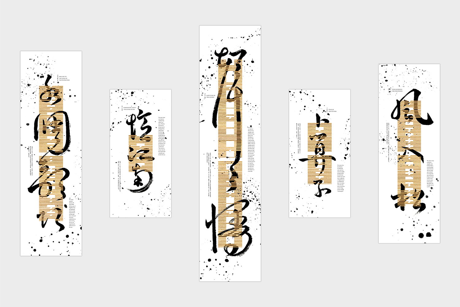
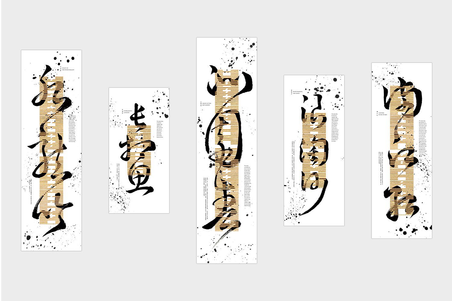
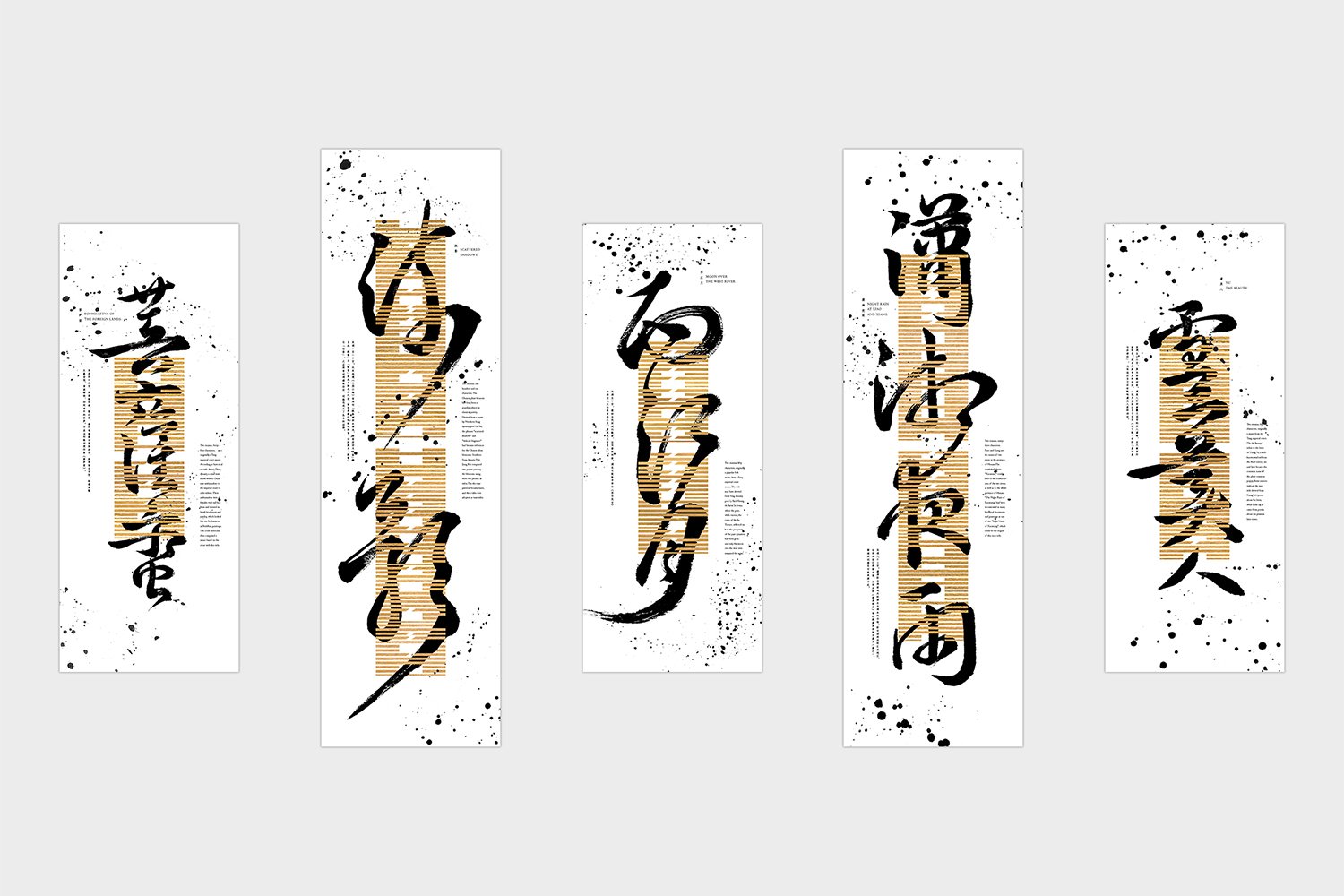
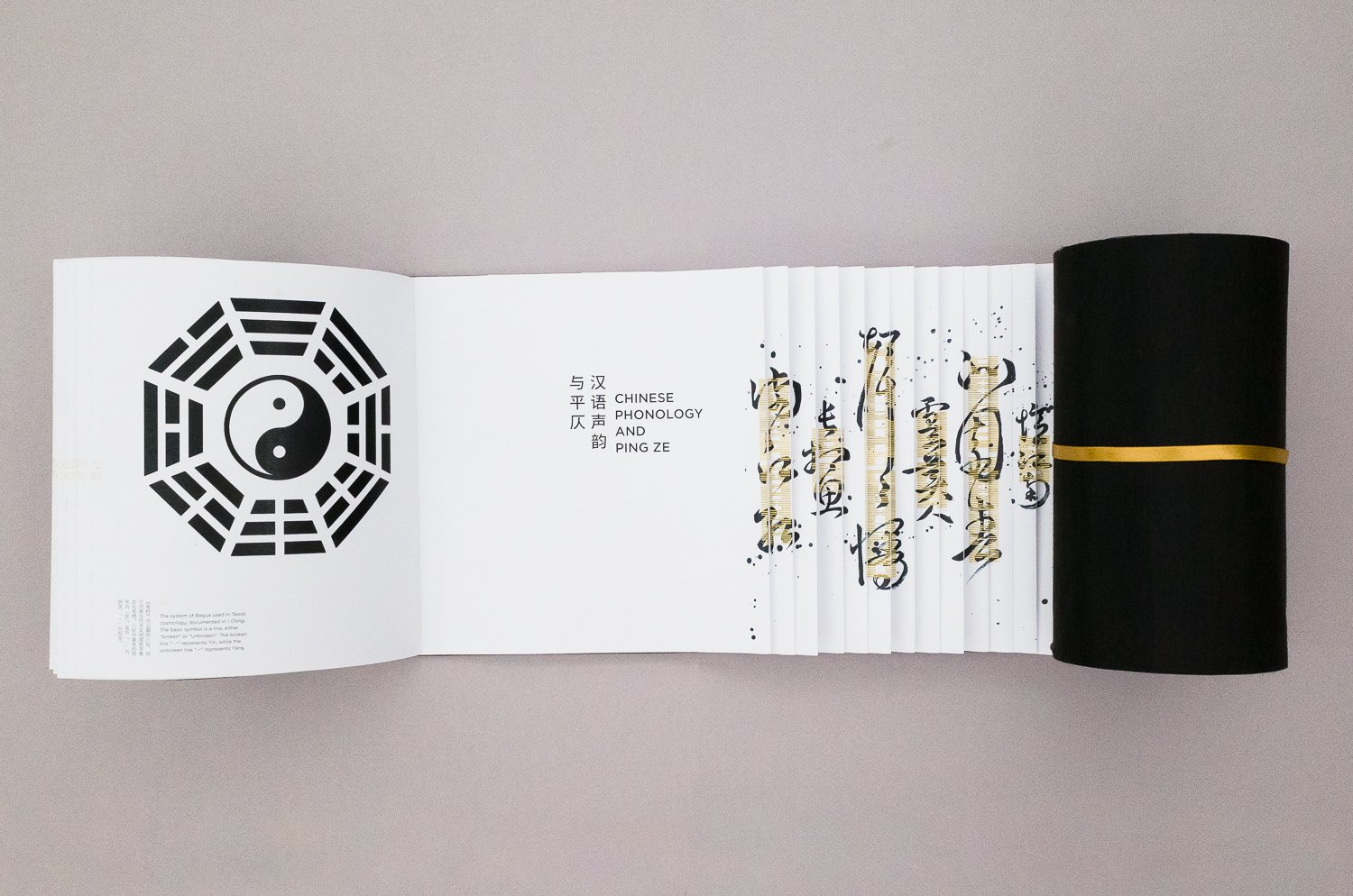
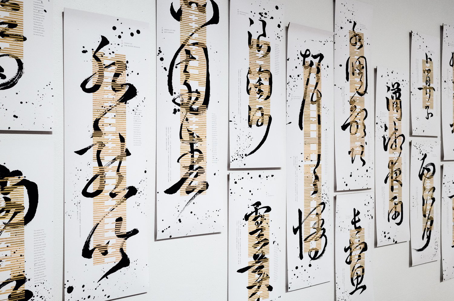
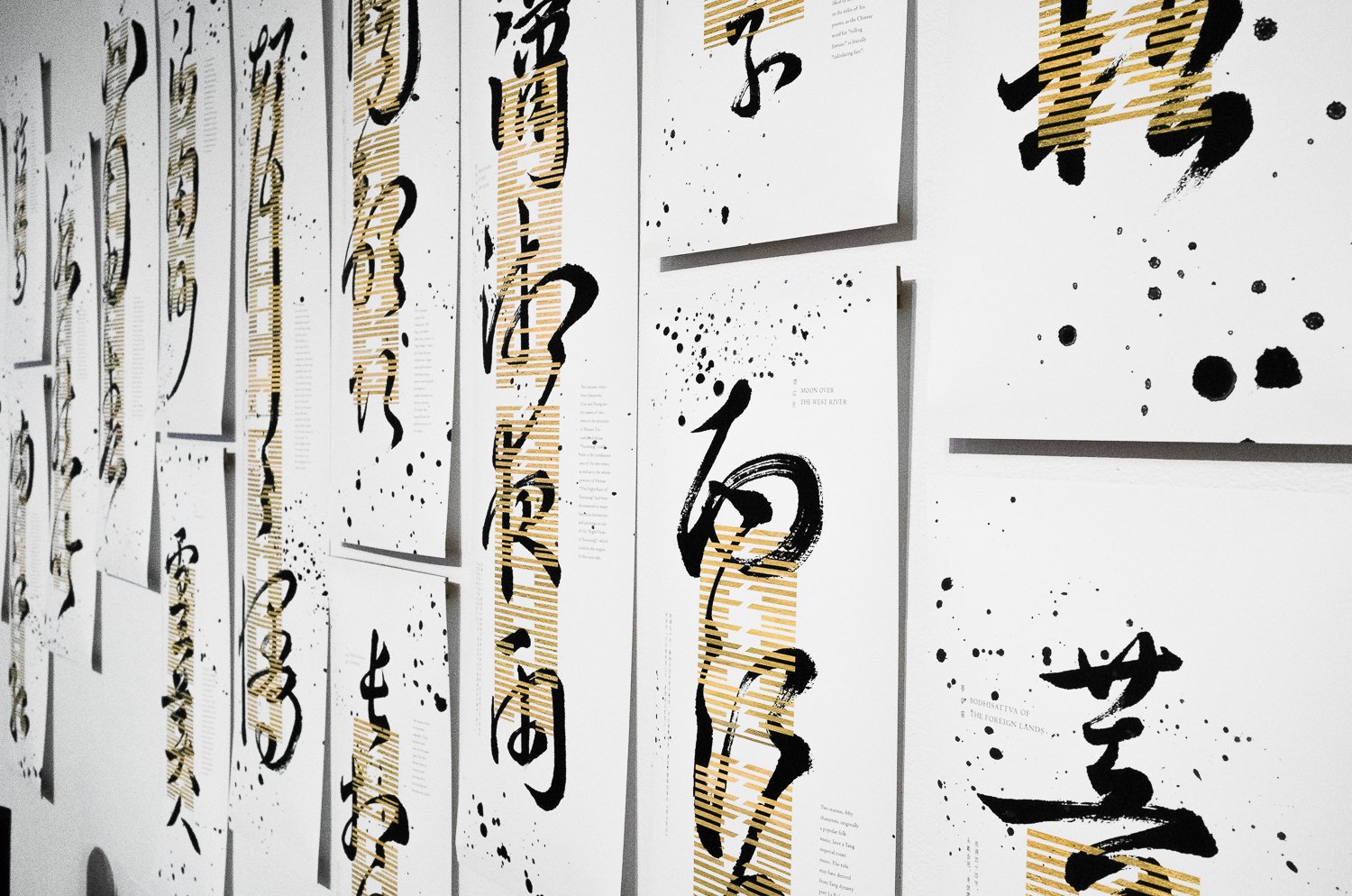
In Middle Chinese, all of the Chinese characters are divided into two groups based on their tones: ping, literally “level”, meaning no pitch changes when the character is pronounced; and ze, “oblique”, meaning with pitch changes when pronounced. This idea of ping vs. ze is especially important to the ci poetry, because a series of metric patterns, referred to as "tunes", regulate the tone of each character in a poem: whether it needs to be a ping character or a ze one. Each of these tunes is associated with a title, called cipai, which serves as a code name, since usually the title does not describe the tune itself and has nothing to do with the content of the actual poem.
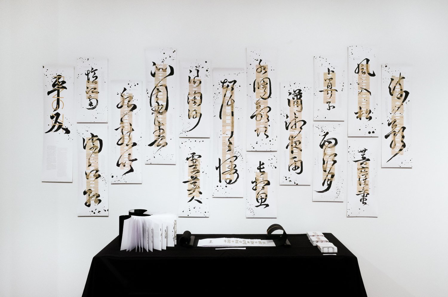
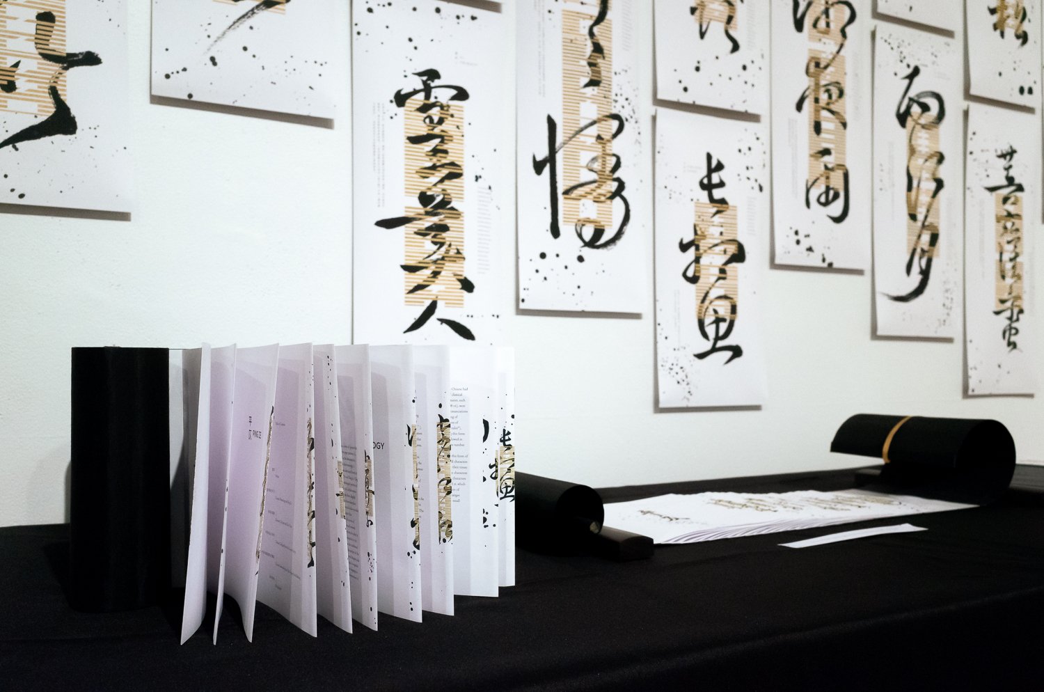
This project includes a series of posters that seek to visually represent the pingze patterns of a selection of tunes, as well as the disconnection between the tune titles and their meanings. A system of stripe patterns was developed based on the symbols that represent Yin and Yang in I Ching, in order to visualize the phonological patterns of pingze in each tune. The height of each poster is thus determined by the character-count of each tune. The tune title is then written in cursive calligraphy, to render them illegible and abstract, and thus distant them from their meanings. Additional information is also provided regarding the origins of the tune titles.
这组作品以宋词词牌以及汉语音韵中的平仄为研究题材,探究如何将抽象的文学及声韵概念转化为具象的视觉元素,从而让不同语言文化背景的观众都能从不同角度领略汉语文学及语言的魅力。
在中古汉语中,所有的汉字会根据它们的声调被分为“平”或“仄”两类。“平”即没有音调变化,而“仄”即有音调变化。平仄的概念在宋词中尤为重要,因为宋词中的一系列词调规定了一首词中每个字的平仄。这些词调都有各自的标题,便是词牌。虽然这些词牌名都会作为词题的一部分出现,但是他们通常既不描述词调的格律,也和词的实际内容无关,仅仅是作为一个代号而已。
这组作品包含了一系列的海报,以视觉元素来描述一系列词调中的平仄变化,以及词牌所表达的意象和实际内容相脱离的关系。其中各词调的平仄用一套基于《易经》中阴阳爻的条形图案来表示,用以描述各词调中的平仄变化。每张海报的长度也因此由各词牌的长度而定。各词牌名则用草书书法书写,从而将汉字抽象化,将其表达的意象从文字中抽离。海报中也加入了额外信息用以阐述各词牌名的来源和典故。
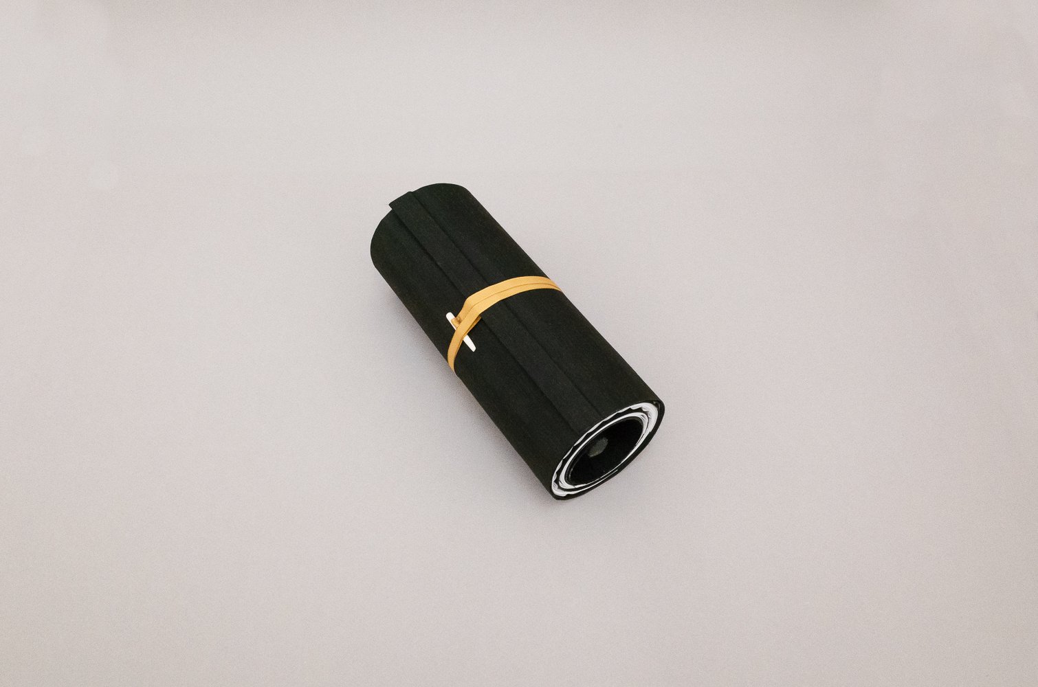
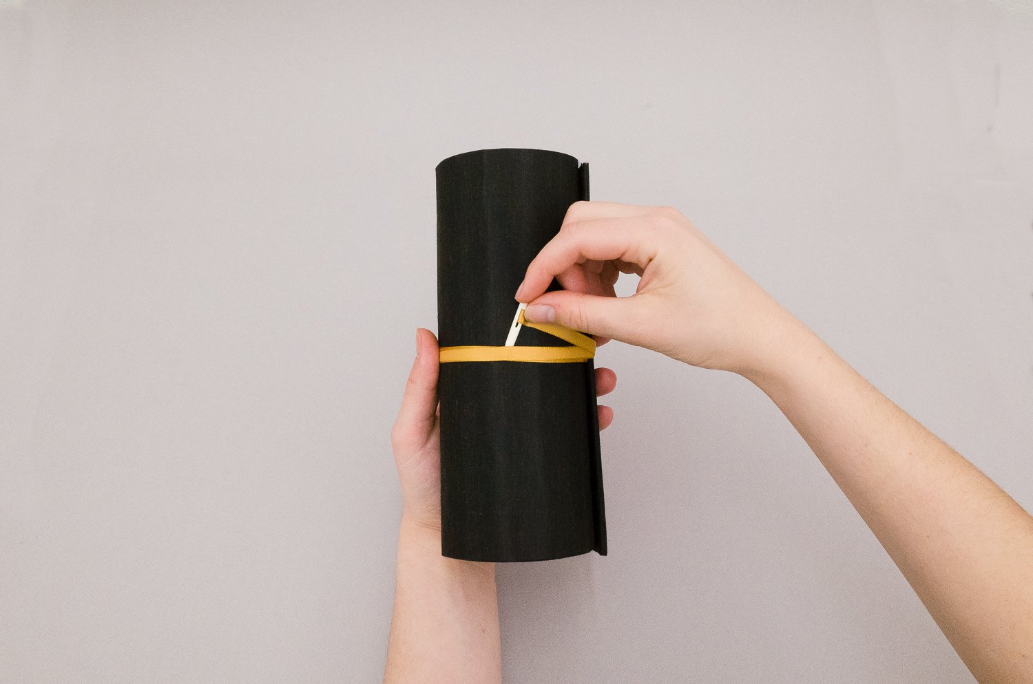
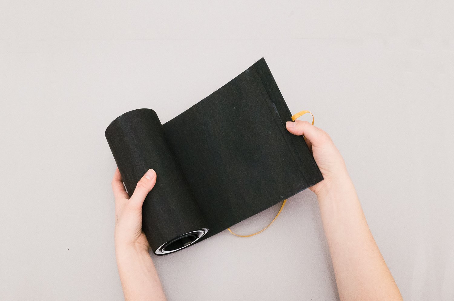
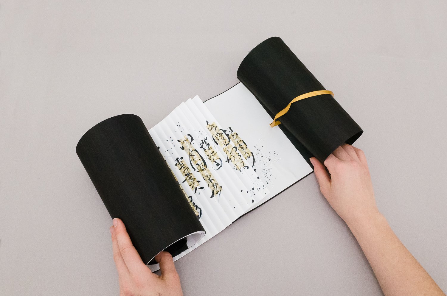
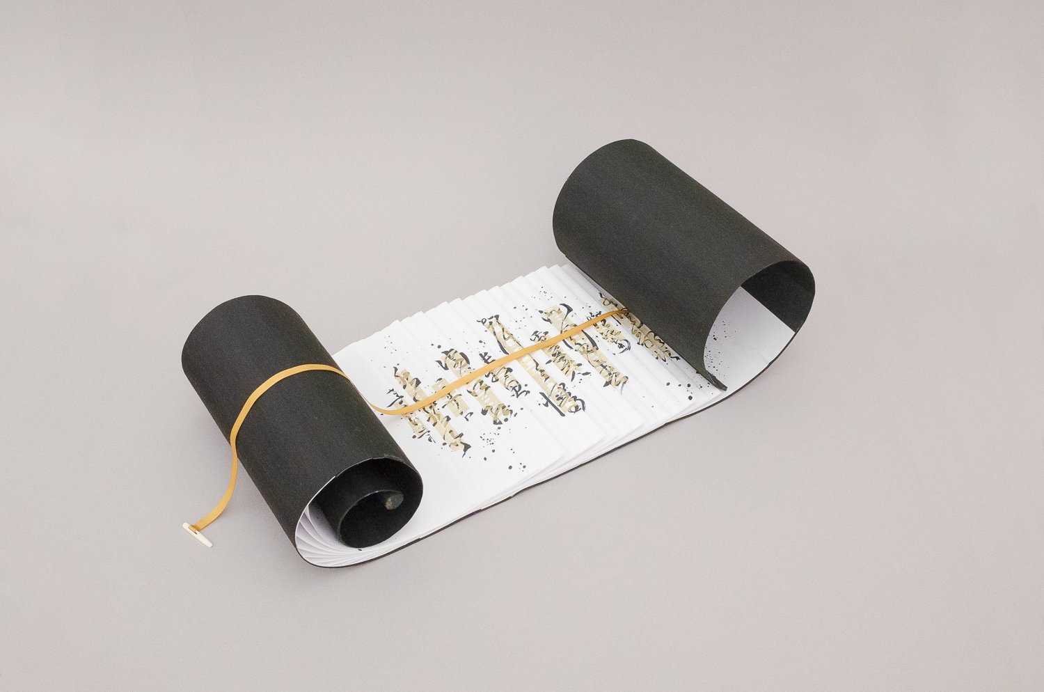
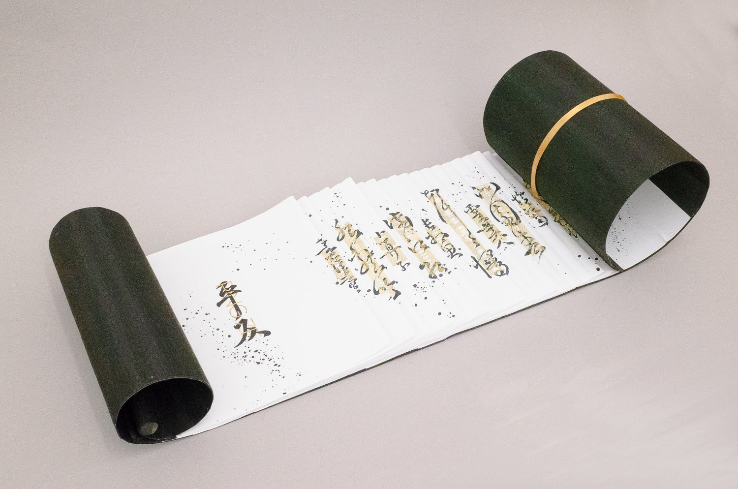
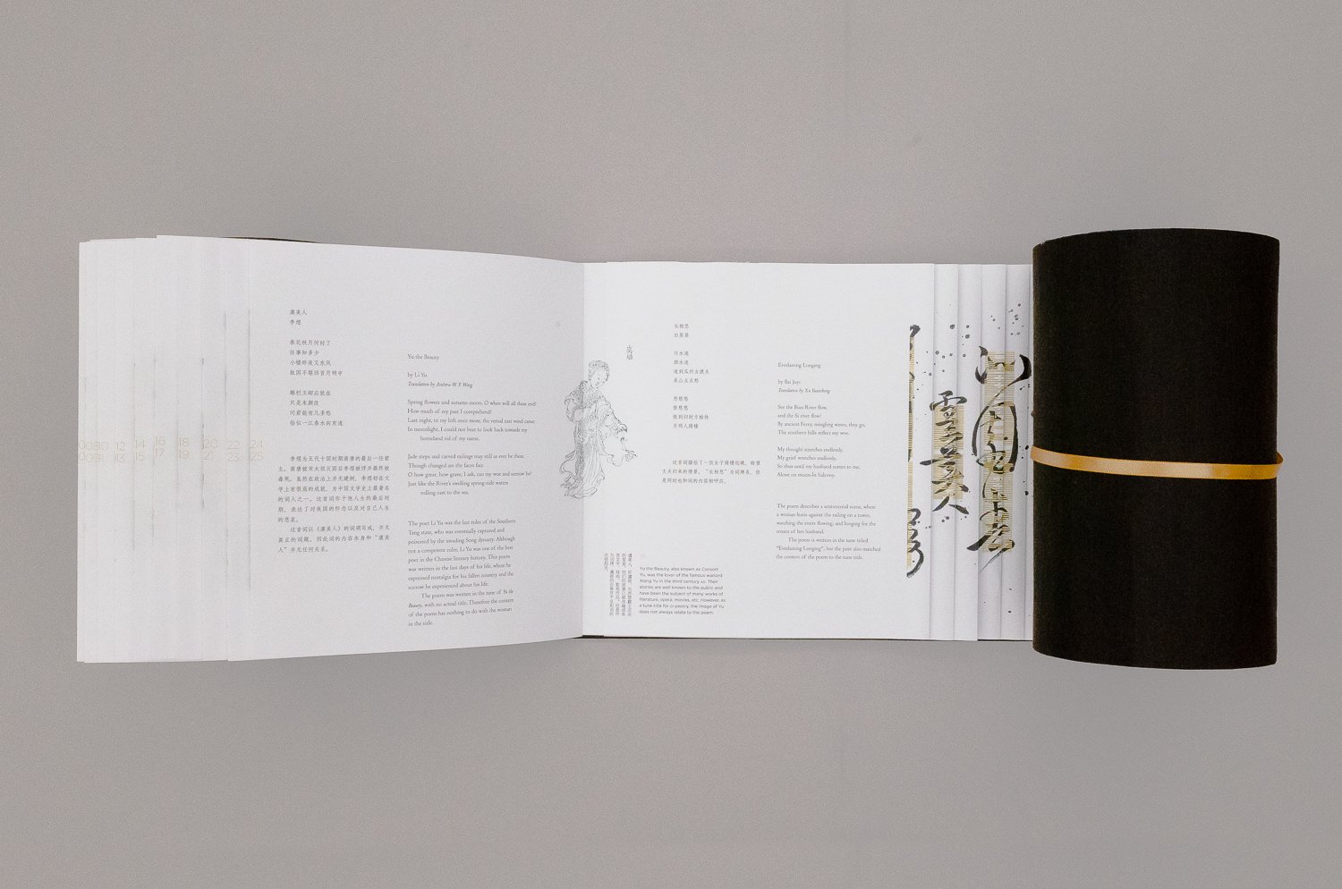
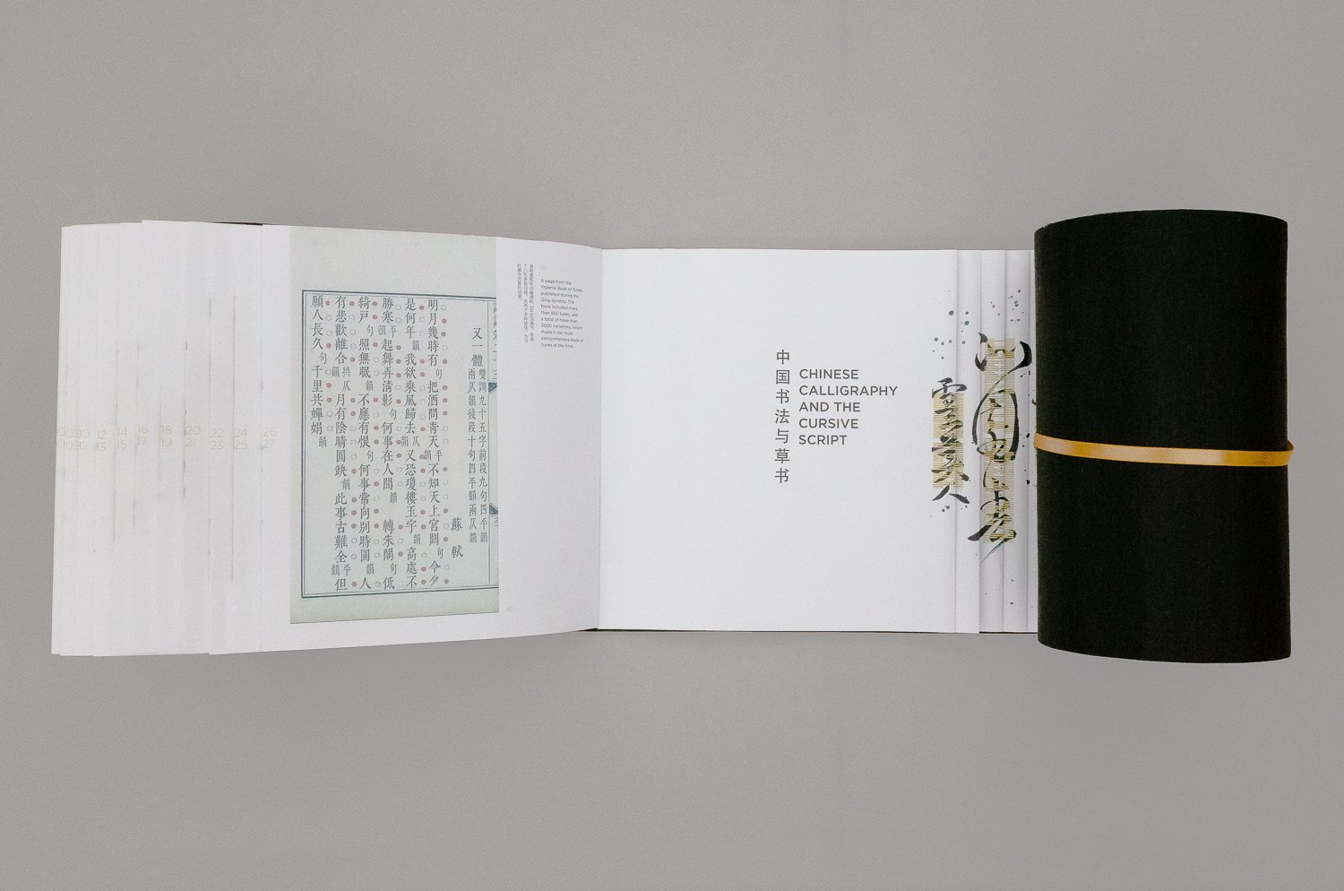
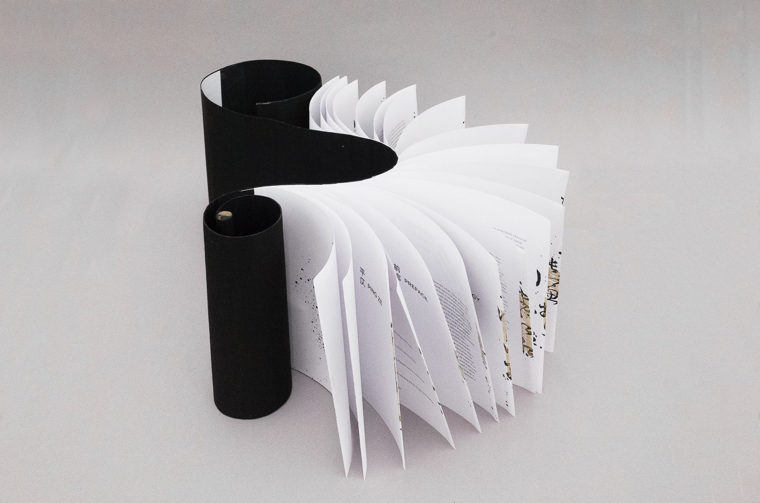
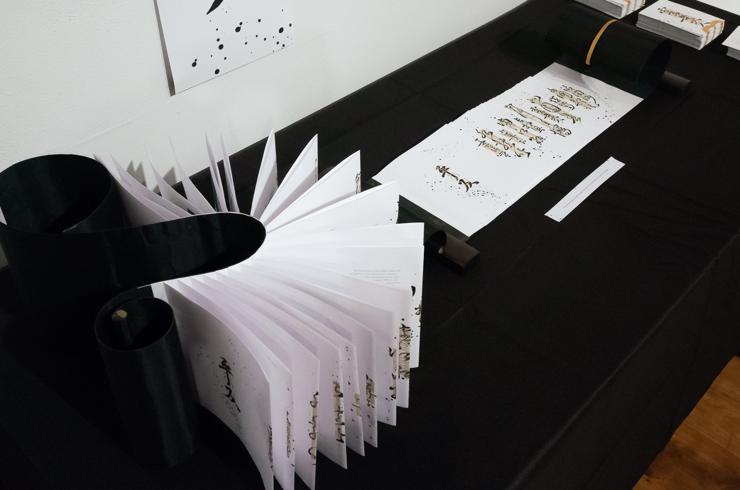
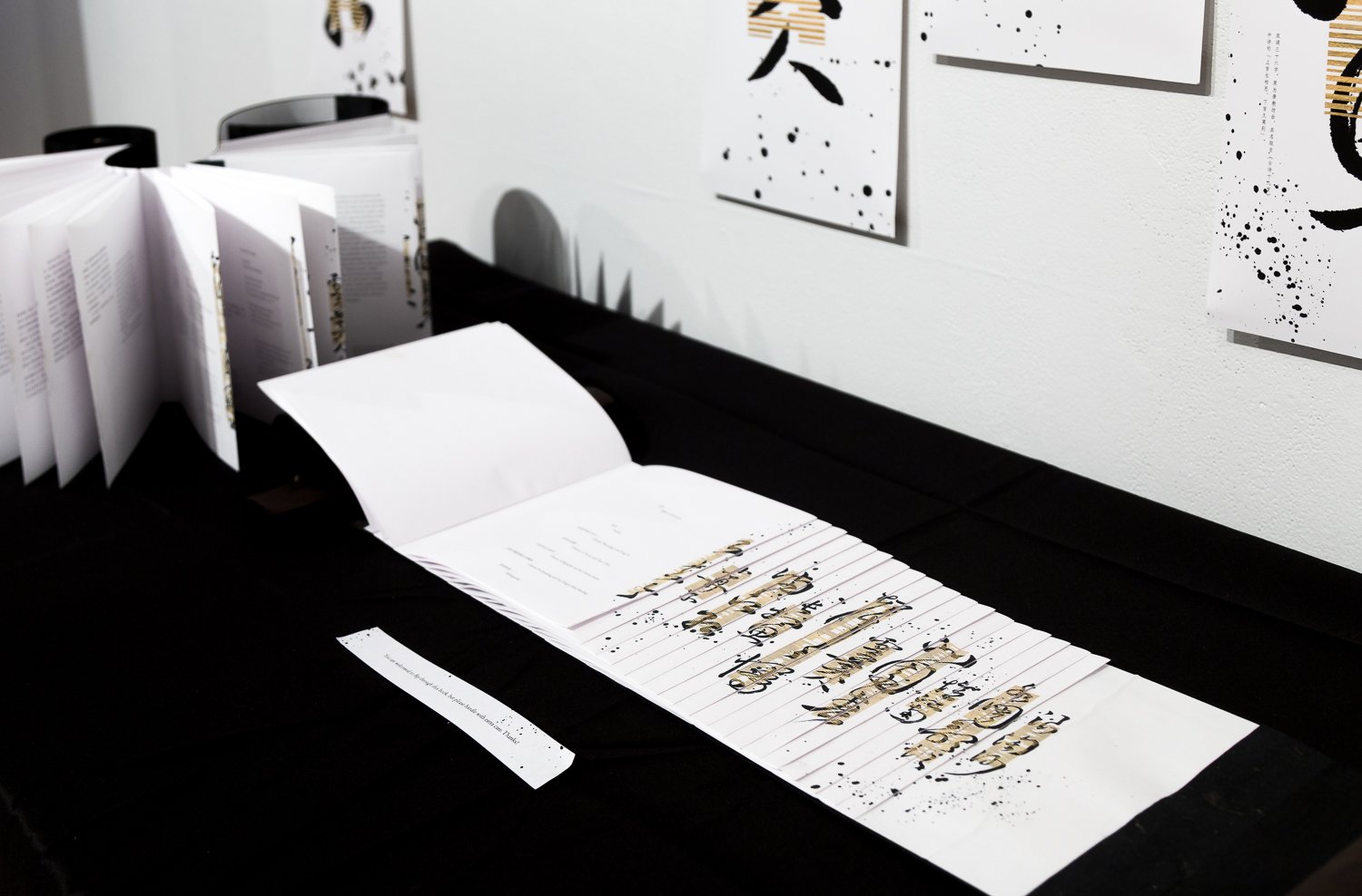
A scroll book accompanies the series of posters, compiling the historical research done throughout the design process, in order to provide more background information to the audience. The book is bound in the historical dragon scale binding style to reflect the subject of the project. It is believed that this binding method was developed for making reference books, among which many were rhyming dictionaries used to regulate the pronunciations of the Chinese language at the time, as well as to guide the composition of classical poetry.
这组作品同时包括一本卷轴书,汇编了设计过程中进行的历史研究以及收集的各类资料,为观众提供必要的历史背景信息,从而帮助其更好地理解作品中涉及到的文化与语言现象。这本书以历史上的龙鳞装的方式手工装订,来呼应作品的主题,因为据推测龙鳞装是唐朝时期被发明出来专门制作工具书的,其中很多为古时用来规范汉语发音及指导诗词创作的韵书。
The project was first exhibited during the Boston University 2018 MFA Thesis Show, at the Stone Gallery, in April 2018.
作品于2018年四月在波士顿大学2018艺术硕士毕业作品展中首次展出于Stone Gallery。
This project has received the following recognitions:
Certificate of Typographic Excellence, Type Directors Club Competition 2019
Merit Award, Student Work Category, HOW International Design Awards 2019
Winner, Students Category, GDUSA American Graphic Design Awards 2018
该作品获得了下列奖项:
字体指导俱乐部 (TDC) 2019竞赛优秀奖
HOW国际设计奖2019学生作品类别优秀奖
GDUSA美国平面设计奖2018学生类别优胜作品
Special thanks to Prof. Nicolas Rock for his guidance during the development of this project, and to Katherine Ruffin for her expertise in bookbinding.
特别感谢 Nicolas Rock 教授对于毕业设计的指导,以及 Katherine Ruffin 老师对于书籍装帧的解惑。
← Back